Tottenham Hotspur have had some shocking kits down the years.
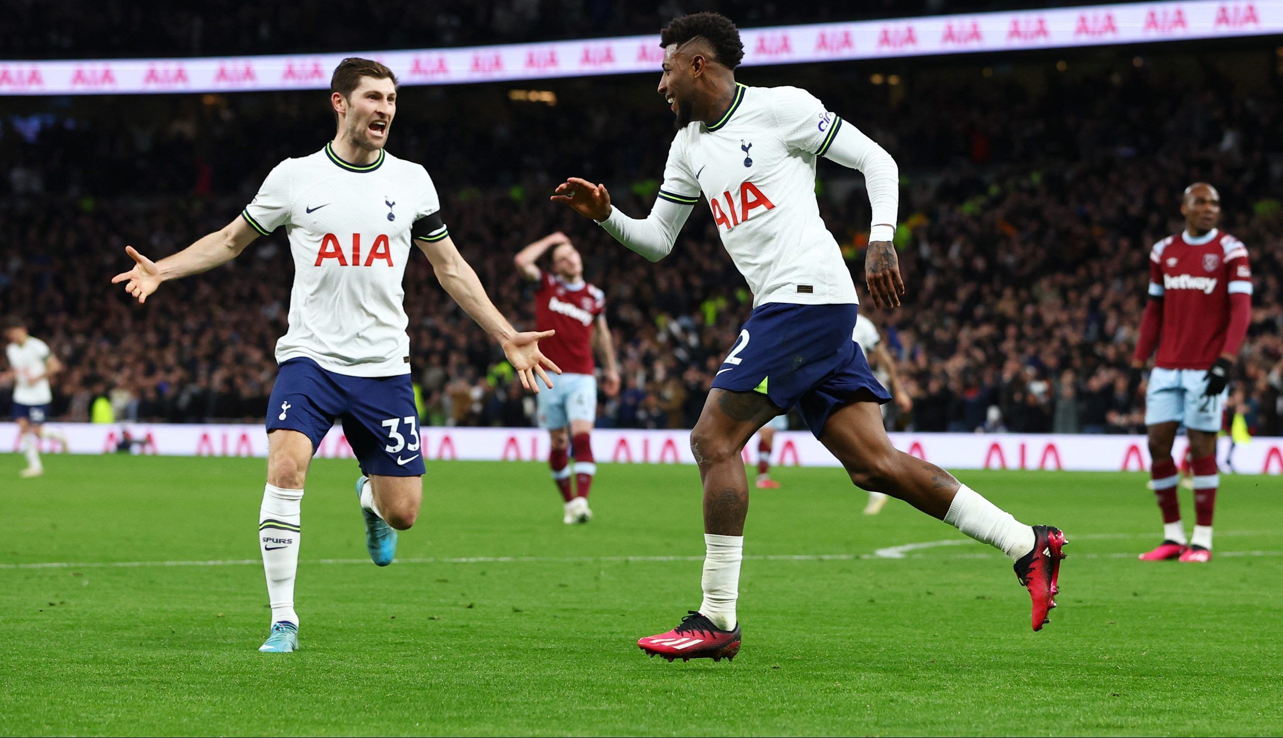
Spurs are a club with a proud tradition of wearing lilywhite, of course, and their home kits are regularly white and navy.
It’s very hard to ruin a Spurs home shirt, but they do make some bizarre decisions when it comes to their away kits.
This season, for example, we’ve seen an away kit that looks more like a scuba diving suit, and that really is something.
As a result, we’ve taken a look at the 10 worst Spurs kits from the Premier League era.
10. 2009/10 Home
This is a really bizarre shirt, isn’t it?
As we’ve said, most Spurs shirts have blue accenting, which fits with the white quite nicely.
This one didn’t, this one had yellow accents. That is not good.
Add in the red Mansion sponsor and the kit looks very confused.
9. 1994/95 Away
Early into the Premier League era here and we’re back in the land of the baggy shirts.
This one isn’t bad because of that but the purple just doesn’t work, the badge is massive, and the collar doesn’t work.
Add in the weird contrast on the shorts and you’ve got a stinker.
8. 2006/07 third
This one is dreadful.
It’s meant to be chocolate coloured, we think, but it isn’t, it’s just brown.
It also has the gold trim but it blends into the brown and looks dodgy.
Awful.
7. 2016/17 third
These were divisive when they came out.
Some loved the bold nature of the shirt and the uniqueness of the pinstripes.
But it looks like someone spilled mustard on a Spurs shirt.
Even the fact that AIA isn’t red, as it usually is on Spurs kits, can’t save it.
6. 2013/14 home
Under Armour tried some new things but they rarely worked.
This Spurs home kit has such a strange looking collar, and is also largely ruined by the massive HP sponsor.
It doesn’t help that Spurs had just sold Gareth Bale when they started wearing this, and they didn’t exactly perform well in it.
5. 2010/11 away
This one is a little strange, really.
It’s very muted in terms of its colour scheme and the trim doesn’t really work.
It’s very safe, and very boring. Dull.
4. 2012/13 third
This is slightly iconic because of Gareth Bale but the kit doesn’t work.
You’ve still got a splash of yellow, the black and grey don’t really go together, and it looks a bit like something you’d buy in Sports Direct for a fiver.
Under Armour took some big swings but they usually missed.
3. 2018/19 third
Okay, so we know that this is arguably the most iconic Spurs kit of the modern era.
Lucas Moura scored his hat-trick against Ajax in this green number, sending Spurs into the Champions League final.
However, the shirt itself is an absolute mess.
It looks like paint has been randomly thrown across the design, and the shades don’t contrast properly.
A woeful effort, but that Ajax game stops it from being in the top two places.
2. 2017/18 third
It’s purple, but it’s also camouflage. That doesn’t work as a combination.
The bright yellow of the sponsor, manufacturer and club badge actually hurt the eyes, and the yellow accents look woeful.
There’s too much going on and it doesn’t hold together.
1. 2022/23 away
This thing is dreadful.
We’ve established in this list that any kind of yellow in a Spurs kit rarely works and it’s the same here, but the colour combination reminds anyone looking of scuba diving.
The badge in the middle, above the Nike tick, also makes the shirt look strangely fake.
Let’s never speak of it again after this season.